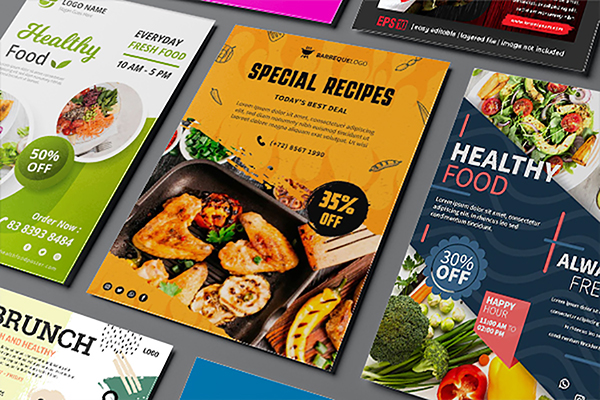
Using restaurant flyers or their online banner cousins to draw in new customers is a smart move. Focusing on your most recent promotion will help you sell more or get rid of inventory faster. Your brand will end up in the trash or buried under a pile of papers if you do not come up with an eye-catching design.
Flyers are a cost-effective means of spreading the word about your company’s products or services. It is
also a great way to stay in front of existing customers and draw in new ones. Because they are inexpensive, easy to make, and do not harm your brand, they are a great option for any business.
It is your silent brand ambassador before the client even sees your menu, location, or website. Your restaurant’s success depends on how well you design this small piece of paper or digital real estate.
Flyer Designing Tips to Promote Your Restaurant
Step 1: Use Bright Colours
Colours and textures that pique a person’s interest and make them want to eat are the essence of food. Flyers should be as irresistible as pizza and as difficult to forget as cheesecake.
You have the option of showcasing the final product or highlighting the quality of the ingredients. Make sure that the visual areas are separated by some white or negative space, so that each dish has an opportunity to shine.
Step 2: Keep the Flyer Light and Fun, But Also Inspiring and Educational
On your flyer, you only need a call to action and some motivational language aside from your contact information.
On your website, everything else should be. You can choose a few dishes to share if you decide to do so. Do not use a flyer from a nearby restaurant as a menu substitute.
Spend time and energy showcasing your menu’s highlights and high-value items.
Step 3: Appeal to Audience
Your ultimate goal is to get customers to spend more money by making them as hungry as possible. The simplest way to do this is to activate their primitive senses. Show off your food in mouth-watering photos or videos. Anyone looking at this fiery banner is likely to immediately picture a juicy steak or burger; even without clicking it, you can almost smell the charred meat flavor.
Step 4: Focus on Material
If you want to make a big impression with a simple flyer design, consider using a special type of paper. Print contrasting colors on brightly colored pages. It is also possible to use a thicker piece of paper, but this may be prohibitively expensive.
Step 5: Decide on a Unique Template for the Flyer
The background, colour scheme, fonts, image proportion, and overall feeling are all things to keep in mind when selecting a template.
Rounding Up
You do not have to match your logo or branding exactly; you can change the colour scheme to fit the occasion. You should use colors that make people hungry because you are dealing with food. According to neuro-marketing studies, color has a significant impact on food sales. It is best to avoid blue tones unless they’re being used as a decorative element.


