Design is an ever-evolving field, and with the advent of new technology and trends, it’s important for designers to stay up to date on what’s popular in the industry. In this blog post, we will explore the latest trends in graphic design in Singapore, from using the right tools to creating impactful visuals with colour and contrast. We will also discuss how to use typography effectively and choose the right layout for your design. With these tips, you’ll be able to incorporate current trends into your designs and keep your work modern and relevant.
Understanding the latest graphic design trends
To stay up to date with the latest trends in graphic design in Singapore, it is essential for businesses to be aware of what is going on in the industry. Following popular blogs and magazines related to design can provide an invaluable source of information on new techniques, tools, and aesthetics that are being used. Additionally, research-based tools such as Google Trends can give insight into current trends as well as what might become popular soon. Moreover, keeping an eye on your competitors’ designs and strategies can offer ideas for incorporating elements into your own work (as long as they fit within company guidelines). Furthermore, attending design conferences or award shows is a great way to gain inspiration from award-winning designs. Finally, understanding cultural differences in aesthetic preferences will enable you to tailor visuals that have maximum impact across audiences. By taking all of these steps into consideration, businesses can ensure their designs are current and relevant.
Using the right tools for graphic design
When it comes to creating a compelling graphic design, the right tools are essential. Depending on your project’s needs, there are a range of software programs that you can use for different aspects of your design work. Vector-based software like Adobe Illustrator can be used to create vector art and illustrations, while 3D design software such as Blender and Maya offer powerful tools for creating 3D objects or animations. For digital painting projects, Procreate and ArtRage provide intuitive interfaces with natural media emulation capabilities. Photoshop and GIMP are the industry standards for photo editing, while HTML, CSS and JavaScript allow you to create dynamic web designs.
Each tool has its own unique features that may be suited to certain types of design projects more than others. Vector-based software is great for creating scalable graphics that retain their crispness even when resized – making them ideal for logos, icons and other artwork intended for print or digital media. 3D design software offers robust tools for creating realistic scenes or objects in three dimensions – perfect if you have an animation project in mind. Digital painting programs allow designers to emulate traditional painting techniques with digital brushstrokes, while photo editing suites like Photoshop offer sophisticated colour correction and retouching features that let you quickly produce professional results from photos or graphics. And lastly web design requires coding expertise which can be obtained through HTML, CSS and JavaScript learning resources available online.
In addition to understanding each tool’s features, it is also important to stay up-to-date with the latest trends in graphic design so your designs remain current and relevant. Following popular blogs and magazines related to design, using research-based tools such as Google Trends to analyse industry trends, keeping an eye on competitors’ designs, attending design conferences and award shows can help businesses stay ahead of the curve when it comes to designing effective graphics. Understanding cultural differences in aesthetic preferences is also a crucial part of remaining competitive within the industry – something that cannot be overlooked by designers working across multiple markets.
With so many options on offer today – from vector-based illustration platforms to powerful 3D animation suites – choosing the right tools for graphic design can seem daunting at first glance. But by taking the time to understand each tool’s features as well as staying up-to-date with industry trends, you will find yourself better equipped to make informed decisions about which program best suits your project’s needs—ultimately helping you create more impactful designs faster than ever before!
Creating an impactful design with color contrast
When it comes to graphic design, colour is perhaps the most important element. The right colours can add vibrancy and life to a design, while the wrong colours can make a design look flat and dull. Colour theory plays an essential role in creating an impactful graphic design; understanding how different colours interact with one another and how they are perceived by viewers is key to making sure your designs stand out for all the right reasons.
When choosing a colour palette for your project, consider what kind of message you want to send and what emotions you would like your audience to feel when viewing your work. Using contrasting colours—that is, colours that are opposite each other on the colour wheel—can create a dynamic visual effect. For example, pairing warm colours such as red or yellow with cool blues or greens creates contrast that draws attention and makes text more legible.
It’s also important to think about the context of your project when selecting colours; cultural differences in aesthetic preferences should be taken into account when selecting a palette for international audiences. For example, certain shades of blue might have different connotations in different countries. It’s also important to keep in mind that some cultures may perceive certain colours as being more positive or negative than others—for instance, in East Asian cultures white often symbolizes death while green symbolizes luck and growth.
To effectively integrate colour into your design projects, consider using color-coding systems such as monochromatic schemes (which use shades of one hue), complementary schemes (which use two hues directly opposite each other on the colour wheel), analogous schemes (which use three adjacent hues on the colour wheel), or split complementary schemes (which combine a base hue with two complementary hues). Using these systems can help ensure that all elements coordinate seamlessly and draw attention where it’s needed most.
Ultimately, understanding how to effectively incorporate colour into graphic design projects is an essential skill for any designer looking to create impactful visuals that stand out from the crowd. By carefully considering which palette best suits their project’s needs and employing effective techniques such as contrast and colour coding systems, designers can create powerful visuals that capture their audience’s attention and communicate their message effectively.
Using typography effectively in graphic design
Typography is an essential element of graphic design, with the power to draw viewers in and establish a memorable impression. When used correctly, it can be a powerful tool for achieving stunning visual results. To do this effectively, designers must have an up-to-date understanding of current trends and techniques when it comes to typefaces, font size, line spacing and colour usage.
The right typeface can set the tone for your design project; from traditional and sophisticated to modern and cutting-edge messaging. Once you’ve chosen the appropriate font for your design, then carefully consider how you will use it within your work – adjusting font size accordingly so that legibility is not compromised but aesthetics are still achieved. Line spacing should also be taken into account as this plays a key role in creating smoother reading experiences for viewers. Colour should also be used strategically throughout typography designs; by utilizing bolding or contrasting colours in certain words or phrases these can draw more attention to particular points within text blocks that may otherwise go unnoticed.
By keeping up with the latest trends in typography – such as selecting appropriate typefaces, adjusting font sizes appropriately, applying correct line spacing techniques and using colour strategically – designers can create visually stimulating designs that communicate effectively with their audience.
Choosing the right layout for your graphic design
Creating a visually appealing and up-to-date graphic design starts with selecting the right layout. To create an impactful and modern design, you should analyse current trends to get a better understanding on what is currently popular. Taking a look at successful past projects can be helpful in this regard as it will provide insights on how typography, colour, contrast, and other elements have been used to create engaging images.
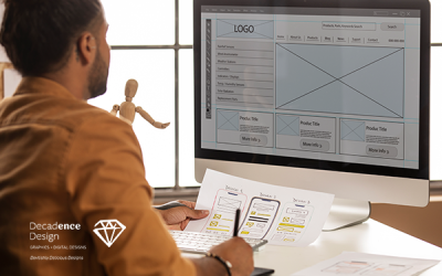
In order to ensure that all elements are placed in an organized manner, it is important to begin your project by using a grid layout. This will also make it easier for you to adjust components when needed. Moreover, be mindful of which typefaces and fonts you choose as they play an integral role in making your design stand out from the crowd. Utilizing too many different fonts or styles could distract users from the message behind your work so make sure not to overload it with too much information at once.
Once you have established a basic composition utilizing these features, you can further enhance your design by adding interactive elements such as hover animations or interactive graphics. These features can help draw attention while adding another layer of engagement for users who interact with your content. Additionally, incorporating motion into the image can emphasize certain parts while creating visuals that capture user interest quickly.
By choosing the right layout for your graphic design project and utilizing these techniques effectively, you can produce designs that are both trendy and captivating! With practice comes skill so don’t be afraid to experiment until you find a style that best suits the needs of your project!


