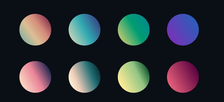
Beauty may be in the eye of the beholder, but there is no denying good design. 2018 seems to be shaping up to be a year of bold and colourful design, and we are really feeling the energy from the colour dynamism surrounding us!
With so many design trends that you could cherry pick from this year – such as using more colours in your design, indulging in some major colour saturation, giving your design some depth with drop shadows – which is the one thing you should really focus on?
We’ll make the call and say: GRADIENTS!
You may have memories of the overuse of the gradient aesthetic thanks to Wordart on Microsoft Powerpoint back in the late 1990s and early 2000s – and trust us, we still remember those days.
But the Gradient trend of 2018 has (thankfully) been updated to be more subtle and less in-your-face, to create mood and depth rather than as just a way to grab attention. Designers know it as Gradient 2.0, and its resurgence dates all the way back to 2015 or so when Instagram introduced its new logo to the world – complete with rainbow gradient.
The best way to use Gradient for 2018 is to mix it up with the use of flat colours in your design. This instantly keeps your design fresh and modern, as the gradient is anchored against the flat colour in a way that does not overwhelm but rather, adds to the depth of the design.
Many of the big brands have already hopped on the Gradient bandwagon – to much success! Other than Instagram, Spotify and Dropbox have applied some gradient elements to their brand and can we say that we are really loving what we see? 😀
We’ve been dabbling in some subtle gradients for our clients recently, trying to keep the designs fresh while retaining their distinctive brand and corporate identity. Gradients do not have to be in-your-face and loud; they can be done subtly and cleverly without overwhelming the entire design. Have a look at one of the designs we did for our client
Real Centre Network, which does not detract from their corporate image but includes a splash of refreshing gradient in the background!


