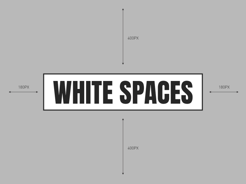
In this article we will discuss the vital role of white space in graphic design. In the realm of graphic design, there’s an often-overlooked hero that quietly holds the key to impactful and aesthetically pleasing creations: white space. Contrary to its name, white space isn’t merely about the colour white; it’s the strategic use of empty spaces, unmarked areas, and breathing room within a design canvas. While it might seem counterintuitive to leave parts of a design blank, the deliberate incorporation of white space is an art form in itself, playing a pivotal role in creating balance, enhancing readability, and evoking emotions.
Defining White Space
White space isn’t just an absence; it’s a deliberate choice made by designers to ensure that their creations don’t overwhelm the viewer. It’s the blank areas between text, images, and other elements in a design layout. These spaces can be both active (intentional) and passive (resulting from margins, gutters, or spacing). Think of it as the silent partner that guides the audience’s focus and navigation through a visual piece.
The Power of Breathing Room
Imagine reading a page with no paragraph breaks or a design flooded with images and text crammed together. It’s an overwhelming experience that hampers comprehension and engagement. White space offers visual relief, allowing the audience to digest information more comfortably. By providing breathing room, it directs attention, enhances readability, and creates a sense of organisation and sophistication.
Enhancing Visual Hierarchy
Incorporating white space strategically enables designers to establish a hierarchy of elements. It guides the viewer’s eye, leading them from one important piece of information to another. By giving prominence to key elements through ample surrounding space, designers can emphasise the significance of certain messages, logos, or visuals.
Conveying Elegance and Simplicity
Consider some of the most iconic logos or impactful advertisements. Many of them rely on simplicity and elegance achieved through clever use of white space. Apple’s logo, Nike’s swoosh, or even the minimalist posters of Swiss design, all leverage white space to convey a sense of sophistication, clarity, and memorable simplicity.
Emotional Impact and Balance
White space is not just about aesthetics; it also has a psychological impact. A cluttered design can evoke feelings of chaos and confusion, while well-utilised white space can induce a sense of calmness, clarity, and professionalism. It helps strike a balance between elements, fostering harmony and allowing the viewer’s gaze to rest where intended.
In the dynamic world of graphic design, the importance of white space cannot be overstated. It’s not just about filling a canvas; it’s about the deliberate curation of what’s included and what’s left out. It’s the whitespace between the notes that create the symphony of visual communication. Understanding and harnessing the power of white space empowers designers to create impactful, engaging, and aesthetically pleasing designs that resonate with their audience on a deeper level. So, embrace the emptiness, for within it lies the potential for greatness in design.
Embracing the Vital Role of White Space in Graphic Design
XML link


