Maybe you have come to a point where you think your brand no longer reflects who you are. Perhaps you feel the need to respond to a more competitive market. Either way, there’s certainly a reason for your brand to get a fresh, ‘new look’.
Any transition can be difficult because of the uncertainty that comes with it. This especially holds true for entrepreneurs—you are not sure how your current consumers, investors, partners and other stakeholders will respond. You might also be in limbo with fears of affecting the brand equity that you’ve spent some time establishing. While this can be the reality for humble local brands or big multinationals alike, a smart strategy can go a long way.
Although there can be a multitude of factors to consider, especially if you are a sizable brand, there are core areas that you may want to focus on to get your brand revamp started.
Communicate it within the organisation.
It’s wise to remember that behind every brand is not just you, but a team of people with different responsibilities. When you’re setting a new direction for the brand, it is crucial to give a heads-up to the ‘internal’ organisation―the employees, business partners, board of directors and investors (if you have them). Putting this on your priority list ensures the clarity of your messaging. Moreover, this helps to start the engine and to make sure everyone is on the same page.
Scan the environment.
You may have acquired tidbits of information about the market that you are in. However, it is a must to do due diligence and dig deeper on potential risks and opportunities. You don’t want anything to backfire in the middle of the rebranding process, do you?
Scan the market. Whether you’re exploring a new market segment or focusing on only a few, surely there are changes that are worth considering. Pick up finer details such as demographics. Further understand their habits, attitudes and behaviour as well as their usage rate of your website (for example) and your products and services. Take note that in the process, you may unveil a little upgrade or a totally different buyer persona.
Since the brand is centred on how it’s perceived, it’s time for you and the team to decide on identifying the new essence of your brand. Thoroughly discuss how you are going to position yourselves. Will you be the brand that delivers a specialised product line or will you be the brand that engages in a holistic approach to services? Decide on how you want to be quickly remembered when someone hears your name.
Your messaging architecture is not complete unless you consider an equally important component: the LOOK.
Many companies that have attempted a rebranding process eventually failed because they thought that all they had to do was change the product line or target market segment, and retain some of their collaterals.
A savvy rebranding strategy recognises the importance of a brand’s visual communication.
You might want to make your logo, colour scheme, business card, stationery and other visual materials align with the new direction you’ll be taking. It’s important to note, however, that as this step is also crucial, the extent of the changes should not be overdone. This is because it might confuse your audience.
Let’s take the evolution of some famous brands’ logos:
Starbucks

Source: pinterest.com
The current Starbucks logo design was unveiled on its 40th anniversary. Although the colour and other salient details have evolved, the coffee giant has kept the image of a siren since its introduction to the market in 1971:
“She stands unbound, sharing our stories, inviting all of us in to explore, to find something new and to connect with each other. And as always, she is urging all of us forward to the next thing. After all, who can resist her?
Not me.”
Ford
Source: neatorama.com
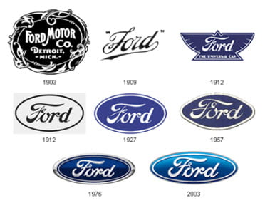
From the art nouveau-inspired 1903 logo, Ford has transformed into a much different look with its blue and silver blade logo―a design aimed to be easily recognisable and consistent with its branding goals.
Shell
Source: www.citizentekk.com
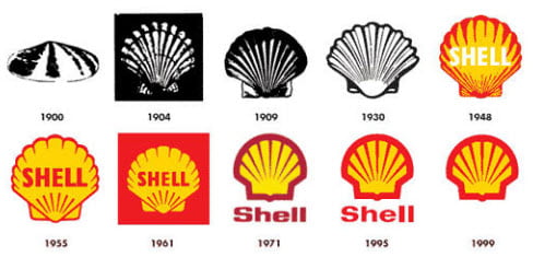
Pecten to scallop, black and white to distinctive red and yellow, complex lines to more simplified lines―these are some of the changes that the Shell logo has undergone since its inception in 1900.
Along with your new logo, you can also start drafting other branding elements and marketing collaterals such as business cards and stationery. While you can do the redesign process in-house, having a design firm do it can save you time and give you design options that have been tried and tested in the current market. Here at Decadence Design, we help brands amplify a stronger branding identity with collaterals that unveil their true essence and personality.
As you go through these steps, it’s crucial to remember that the elements and style should be consistent.
Launch the ‘new you’
Having done all these, creating the ‘new you’ doesn’t end there. You should be able to communicate your new look to your consumers. Let them know how you’re going to satisfy their current needs with your new identity and focus. Launch your new brand and monitor all progress made.
To summarise the salient points we’ve raised, here are few questions to guide you on your brand revamp:
- What are the reasons for your rebrand?
- Have you communicated these reasons to your team and other company stakeholders?
- Have you done careful research on the current market?
- Is your target market changing? If so, how?
- What are the key areas that you want to change?
- Will the change be subtle (evolutionary) or an overhaul (revolutionary)?
- What will your new message be?
- How will you position your new brand on the market?
- What are the changes you want to implement on your visual representations (e.g. logo, business card, stationery, and marketing collaterals)?
Just like when a child learns to walk, your new brand might also stumble along the way. However, if you keep your focus, convey the right message, and work with people who support your vision, you will be become relevant as a brand.
Here at Decadence Design, we believe that a good piece of design is not just a pretty thing to look at, but something that conveys the message it’s meant to say. It should communicate, resonate and connect with people. Let us bring you revolutionary ideas to tell your story in the most enchanting way. Talk to us!


