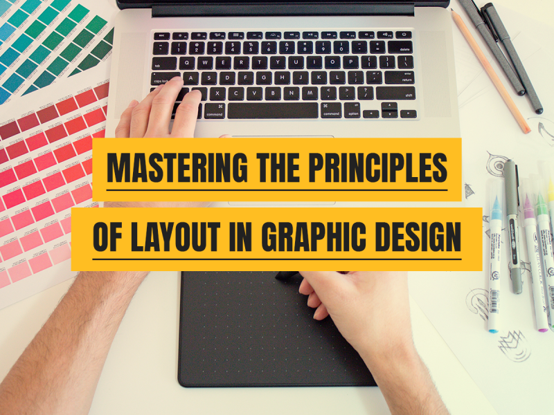
In the realm of graphic design, where visual storytelling reigns supreme, the principles of layout in graphic design serve as the foundational pillars upon which captivating designs are built. From eye-catching advertisements to user-friendly websites, a well-executed layout is the key to engaging an audience and conveying a message effectively. As a graphic design agency navigating this dynamic landscape, understanding and harnessing these principles is essential for crafting compelling and impactful designs.

At Decadence Design, our team of experienced designers can help you create a unique and eye-catching brochure that is sure to grab your customers’ attention. Get in touch with us at contact us for all your creative business needs!
The Crucial Elements of Graphic Design
1. Balance
Balance in layout design is about achieving visual equilibrium. It involves distributing elements—such as text, images, and white space—strategically to create a sense of stability. Whether symmetrical or asymmetrical, a well-balanced design ensures that no single element overpowers the others, thereby maintaining harmony and coherence.
2. Hierarchy
Hierarchy guides the viewer’s eye through the design, emphasising elements based on their importance. This principle allows designers to establish a clear flow of information by employing variations in size, colour, contrast, and placement. By prioritising key elements, hierarchy helps convey the intended message effectively.
3. Alignment
Alignment fosters a sense of unity and order within a design. It involves positioning elements—such as text, images, and graphics—consistently along a common axis. Proper alignment aids readability, enhances visual appeal, and contributes to a cohesive and organised layout.
4. Contrast
Contrast is a powerful tool that highlights differences between elements, drawing attention and creating visual interest. It encompasses variations in colour, size, shape, and texture, allowing certain elements to stand out while establishing a dynamic visual impact within the design.
5. Repetition
Repetition instils consistency and reinforces the overall design identity. Consistent use of fonts, colours, shapes, and styles throughout a project establishes familiarity and strengthens the visual coherence, ultimately contributing to a memorable and unified design.
6. Whitespace
Whitespace, often referred to as negative space, is the breathing room within a design. It provides clarity, enhances readability, and allows elements to stand out. Thoughtful use of whitespace contributes to a clean, uncluttered layout, guiding the viewer’s focus and preventing visual overload.
Applying Principles in Design Agency Workflow
For a design agency, mastering these principles isn’t just about theoretical understanding; it’s about practical application within the workflow. Here’s how these principles come into play:
- Client Brief Understanding: Understanding the client’s goals and target audience is crucial. Applying principles like hierarchy and balance ensures that the design aligns with the client’s objectives while effectively communicating with the intended audience.
- Collaborative Ideation: During brainstorming sessions, incorporating principles like alignment and contrast helps in organising diverse ideas cohesively. It streamlines the creative process and leads to more focused design concepts.
- Prototyping and Iteration: Through prototyping and iteration phases, applying repetition and whitespace ensures consistency and clarity. It allows for refining the design based on feedback while maintaining a coherent visual identity.
- Final Delivery: As the design reaches its completion, ensuring the use of these principles guarantees a polished, professional product that captures attention and effectively conveys the desired message.
Conclusion: Principles of Layout in Graphic Design
Mastering the principles of layout in graphic design is an ongoing journey for design agencies seeking to create impactful visuals. By integrating balance, hierarchy, alignment, contrast, repetition, and whitespace into their design process, agencies can elevate their work, captivate audiences, and deliver designs that not only meet but exceed client expectations. Embracing these principles not only fosters creativity but also forms the bedrock of powerful and effective design communication.


