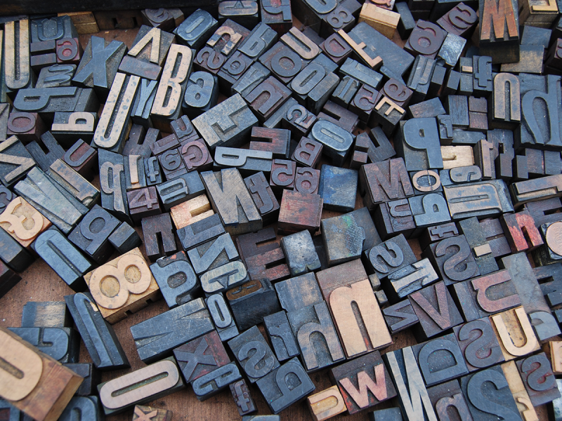
Graphic design is an art form that extends far beyond mere visuals; it’s a language that speaks volumes without uttering a word. And at the heart of this visual language lies typography—the art and technique of arranging type to make written language legible, readable, and appealing.
Setting the Tone
Imagine a world devoid of varied fonts and typographical styles. It would be a monotonous landscape, lacking character and personality. Typography, with its diverse array of fonts, sizes, and styles, sets the tone for a design. Whether it’s the boldness of a sans-serif font exuding confidence or the elegance of a serif font evoking a sense of tradition, each typeface carries its own essence and communicates distinct messages.
Establishing Brand Identity
In the realm of branding, typography plays a pivotal role in establishing and reinforcing a brand’s identity. Think about Coca-Cola’s iconic cursive script or the sleek, minimalist typography of Apple. These typographical choices aren’t accidental; they are carefully crafted to resonate with the brand’s values, target audience, and overall image. Consistency in typography across various platforms and designs fosters brand recognition and loyalty.
Enhancing Readability and Accessibility
Graphic design isn’t solely about aesthetics; it’s about effective communication. The right typography can significantly impact readability, making content more accessible and engaging for the audience. Factors such as font size, spacing, and contrast between text and background all contribute to enhancing readability. Moreover, thoughtful typography choices cater to diverse audiences, ensuring inclusivity and accessibility for individuals with visual impairments.
Evoking Emotions
Typography has the power to evoke emotions and convey messages beyond just the words themselves. The style, weight, and arrangement of type can infuse a design with energy, playfulness, sophistication, or seriousness. A bold, uppercase font might convey a sense of urgency, while a flowing script font can evoke elegance and grace. Designers harness these nuances to evoke specific emotional responses in the audience.
Graphic Design Agency in Singapore
Decadence Design top graphic design agency in singapore, that We are a team of dynamic and creative people who are passionate about delivering top notch designs to help build your brand. Call us now +65 3163 4653
Creating Visual Hierarchy
In any design, guiding the viewer’s attention is crucial. Typography aids in creating a visual hierarchy by organising information based on its importance. Through the strategic use of font size, colour, and style variations, designers direct the audience’s focus, ensuring that key messages stand out and are easily digestible.
Conclusion
Typography is the cornerstone of graphic design—it’s the subtle force that shapes perceptions, communicates messages, and breathes life into visuals. Its influence extends far beyond aesthetics, permeating every aspect of design. From establishing brand identities to enhancing readability and evoking emotions, the art of typography remains an indispensable element in the language of visual communication.
In essence, typography isn’t just about choosing fonts; it’s about wielding a powerful tool that speaks volumes, painting stories and eliciting emotions in the canvas of design.
Graphic Design Agency in Singapore
XML Link


