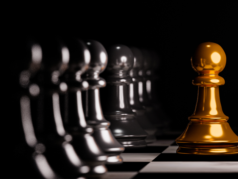
Graphic design is a powerful communication tool that relies on a combination of visual elements to convey messages, evoke emotions, and create a memorable experience for the audience. Among these elements, contrast plays a pivotal role in capturing attention, establishing hierarchy, and enhancing overall visual impact. Furthermore, whether it’s through colour, size, shape, or type, the strategic use of contrast in graphic design can elevate a design from ordinary to extraordinary.
Understanding Contrast in Graphic Design
Contrast refers to the juxtaposition of different elements in a design to make them stand out. Additionally, it involves creating visual distinctions between various components, emphasising differences to achieve a dynamic and engaging composition. Contrast is not limited to colour alone; it can manifest in numerous ways, such as contrasting typefaces, shapes, textures, and more.
1. Colour Contrast
Colour is one of the most potent tools in a designer’s arsenal, and utilising colour contrast can dramatically influence the visual hierarchy of a design. Moreover, high colour contrast, achieved by pairing colours from opposite ends of the colour wheel (e.g., red and green or blue and orange), can create a vibrant and energetic composition. On the other hand, low colour contrast, using similar hues, can evoke a sense of harmony and cohesion.
2. Typography Contrast
In graphic design, text is a fundamental element, and contrast in typography involves playing with font styles, sizes, weights, and spacing. Additionally, bold headlines paired with subtle body text or a mix of serif and sans-serif fonts can establish a clear hierarchy and guide the viewer’s eye through the content. The strategic use of typography contrast can enhance readability and emphasise key information.
3. Size and Scale Contrast
Varying the size and scale of elements within a design adds visual interest and helps communicate hierarchy. Moreover, larger elements tend to grab attention first, while smaller details contribute to the overall composition. Contrast in size and scale can be employed to highlight key elements, create depth, and guide the viewer’s focus.
4. Shape and Form Contrast
Shapes and forms in graphic design can convey different meanings and emotions. Combining geometric shapes with organic forms, or contrasting sharp angles with smooth curves, adds a dynamic visual appeal. This type of contrast can be particularly effective in logo design and creating memorable brand identities.
5. Texture Contrast
Texture adds a tactile quality to a visual design, and contrasting textures can create depth and richness. Additionally, smooth textures juxtaposed with rough or patterned surfaces contribute to a multi-sensory experience. Texture contrast is especially crucial in print design, where the audience can physically engage with the materials.
The Impact of Contrast in Graphic Design on User Experience
Effective use of contrast in graphic design goes beyond aesthetics; it directly influences the user experience. Additionally, when applied thoughtfully, contrast helps guide the viewer’s attention, making it easier to navigate and understand the content. Proper contrast enhances readability, aids in information retention, and contributes to the overall success of a design in conveying its intended message.
Conclusion: Contrast in Graphic Design
Contrast is a fundamental principle in graphic design that empowers designers to create visually compelling and communicative compositions. Furthermore, by skillfully manipulating contrast in colour, typography, size, shape, and texture, designers can elevate their work, capture attention, and effectively convey messages. Additionally, the judicious use of contrast not only enhances aesthetics but also plays a crucial role in shaping the user experience, making it a cornerstone of successful graphic design. As designers continue to push creative boundaries, the role of contrast remains a dynamic and indispensable aspect of the ever-evolving visual language.


