Typography is a fundamental aspect of design that goes beyond just choosing fonts for a project. It plays a crucial role in conveying information, setting the mood, and establishing the visual identity of a brand or project. As design trends continue to evolve, so do typography practices. In this blog, we’ll delve into some current typography trends, provide insights into font selection, pairing, and hierarchy, and showcase how our agency has utilized typography to elevate design aesthetics.
Current Typography Trends
- Variable Fonts: Variable fonts have gained popularity due to their flexibility and efficiency. They allow designers to adjust multiple font attributes, such as weight, width, and slant, within a single font file. This trend is particularly beneficial for responsive design, as it ensures consistent typography across various devices.
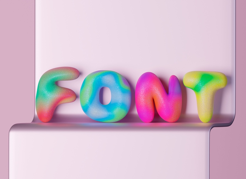
- Maximalist Typography: Bold and expressive typography is making a statement in modern design. Maximalist typography involves using large, attention-grabbing typefaces to convey messages with impact. It often incorporates vibrant colors, gradients, and creative layouts to enhance visual interest.
- Serif Renaissance: Serif fonts, once considered more traditional, are experiencing a revival. Designers are now pairing serifs with modern elements to create intriguing contrasts. This combination adds depth and sophistication to design while maintaining a contemporary feel.
- Geometric and Futuristic Fonts: As technology advances, futuristic fonts with geometric shapes and clean lines are becoming popular. These fonts align well with tech-oriented projects and projects that seek to portray innovation and modernity.
- Handwritten and Personalized Fonts: In contrast to the technological vibe, handwritten and personalized fonts inject a human touch into designs. They can convey authenticity, warmth, and a sense of connection.
Font Selection and Pairing
Selecting and pairing fonts is an art that requires careful consideration. Here are some insights into making wise font choices.
- Contrast is Key: Choose fonts that contrast well to ensure readability and visual interest. Pairing a bold, display font with a more neutral, readable font for body text is a common practice.
- Hierarchy through Variation: Create hierarchy within your typography by varying font sizes, weights, and styles. This helps guide the viewer’s eye and emphasizes important information.
- Maintain Consistency: Stick to a limited number of fonts throughout your design to maintain a cohesive look. Typically, using two to three fonts is a good rule of thumb.
- Consider Brand Identity: The chosen fonts should align with the brand’s personality and values. For instance, a luxury brand might opt for elegant and refined fonts, while a tech startup might lean towards modern and sleek choices.
Typography is a powerful tool in modern design, capable of conveying emotions, guiding users, and elevating brand identity. By staying attuned to current trends, making thoughtful font selections and pairings, and mastering typography hierarchy, designers can create designs that captivate and communicate effectively. At Decadence Design, we are committed to harnessing the potential of typography to transform ideas into visually stunning realities.
Remember, while trends come and go, the timeless principles of typography remain a cornerstone of design excellence. So, whether you’re embracing the maximalist movement or infusing your design with a touch of handwritten charm, typography will continue to shape the way we experience and interpret the world around us.


