Symbols and designs, such as logos, are used to represent a business or organization and all of the things it does, such as its products, services, and even its employees.
A logo’s most basic function is to serve as a means of identification. It’s how people will remember and recognize your business. When it comes to your company’s image, this is an important part.
It is also possible to use your logo to make a statement about your business. However, even though a logo can convey a deeper meaning, it does not necessarily have to. There is simply too much expectation placed on a logo in the majority of logo design projects. Regardless of all this, designing logos is fun and can be made easy with just a few basic steps. Let’s see what they are:
Design a Logo by Following These 5 Steps
Step 1: Consider the Competition
Competition is heavy everywhere nowadays. Regardless of what you are selling, you are going to have a lot of competition. It is imperative that you and your team do some research on the competition before deciding on a logo design. Observe, assess the quality, what stands out, what color schemes are used, and if there seems to be an overused trend you want to avoid in the logo you are designing. Your goal should be to be different from your competition.
Step 2: Design A Customisable Logo
Your logo should be able to adapt to a variety of situations. Your logo can be used in a variety of ways, including online, in print, and on fabric. For instance, you may need to print envelopes in a different format. As a result, it will have to be both scalable and adaptable. The question is whether or not your logo will have the same impact when printed in black and white.
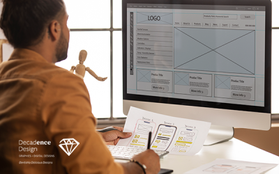
Designer team sketching a logo in digital design studio on computer, creative graphic drawing skills for marketing and branding
![]()
Step 3: Think of Elements of Style
When it comes to colour, you have got a rainbow of options at your disposal. However, your logo will not look great if you use every colour, gradient, or shadow effect you can think of. Fonts, shapes, sizes, and so on, are all examples of this rule. You can experiment with a variety of design elements, but it is critical to understand which ones are most appropriate for your target audience. It is important to keep in mind that you do not want your logo to look like Comic Sans in the professional arena.
Step 4: Use of Icons
Icons, like other design elements, should not be overdone simply because you have the option of using them in your logo. Ask yourself if you really need an icon before you get overwhelmed by all the options. Text-only logos are perfectly acceptable.
![]()
H2: Step 5: Sketching
Even if you plan to outsource the design of your logo to a professional, do not forget to do this. Having a rough idea of how you want your logo to look and feel is essential. In addition to helping graphic designers better understand what you’re looking for, it also helps you remember what you want. Keep an open mind and a variety of styles in mind when creating your work.
Rounding Up
The process of developing a winning logo goes far beyond these initial five steps. The process of creating a logo can be lengthy and time-consuming, but if you do your research and get inspired, you will come up with an excellent design. It is important to keep in mind that the ultimate logo must be adaptable.