
With an overwhelming influx of information and an increasing tendency for humans to scan data and numbers especially on screens, we need to redefine how information is communicated. Infographics are the way to go. These visuals help your audience grasp data easily, by using images and condensed figures. They improve cognition and recognisability through the visual system of the human brain. We go in depth into the art of designing infographics. How will you then transform the contents of this blog post into one?
Every infographic has a story with data. Before starting with designing your infographic, you have to think about the story you want to tell. The point of view you choose will help you determine which information you need to include. Infographics have limited space for content, so the purpose of your infographic should be focused on. The layout of your infographic should not only reflect the theme of information but also enhancing the communication of it. Before starting with the design, create an outline, where you include your headers, data, and any design details you don’t want to forget.
Choose the perfect title
Titles are very important. They should be very catchy and descriptive. The readers should get a sense of what the information will be, to engage them and make them want to read further. It’s also handy if you use bold headlines and specific subheader that tells readers exactly what information they are going to get.
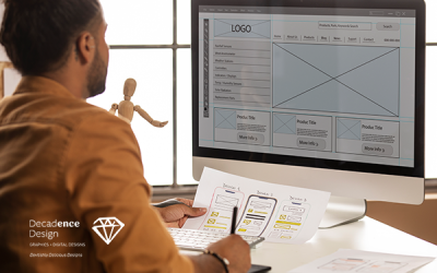
Create a wireframe
Wireframes and grids are the structural base to any design. Designing on a grid let you organise information easily. They also play an essential role. They keep objects and elements aligned. If you align-items, you can reference the same vertical grid line and then space each list item accordingly. It’s very useful to use a grid system to create margins. It’s also good to keep space between the elements and the edge of your canvas to avoid visual tension. You can use any size of margin you want, but it’s important to keep the margin consistent along the edge of your canvas.
Perfect Layout
There are hundreds of possible infographics layouts to choose from. You could use a one-column layout for a minimal infographic or create a list infographic by spitting the layout into two columns. You can try some of the layouts and see which one the best works with your data.
Incorporate different infographic designs
Typography is a very important element for infographic design. It’s one way to explain your ideas and information when images, graphs or icons can’t, so you have to choose the best fonts for your data. Try also to limit the amount of text you want to put in your infographic. The best infographics have their text acting as a secondary explanation for the visual content. Make also sure that your type is legible. Avoid decorative or script type as it tends to be hard to read. To keep infographic designs cohesive, limit your use of fonts to a maximum of three types, but also don’t stick with just one. By using two brands fonts, you can create a nice dynamic and hierarchy of information.
Use photography
Make sure you use photos that have a consistent style and lighting. You need to pick photos with the same lighting effects, same backdrops, the same amount of dark areas. It’s very important to stick to a certain style as images clearly don’t fit the set, it will distract the reader from the information. If you are using a modern use of photography, use only images with flat colour. When you are going for a neutral newspaper approach, you can use black and white images. If you are using a lot of images, which can distract from information, you can solve that easily. You can use a cropping, such as circle frames.
Use contrasts
Contrast gives visual impact by placing two different elements beside each other. When an infographic has a light background with bold coloured shapes, your eyes are immediately attracted to the bold colours. This allows us to organise information by having a certain element more prominent than another.
- Contrast by colours
Colours have a big impact on us. Try pairing complementary colours to make your headline pop.
- Contrast by Typography sizes
The header is usually the largest text in an infographic, followed by the subheader and then the body copy. The header should be the largest so that the reader knows the subject of your infographic right off the bat.
- Contrast by visuals
You can use a tinted image contrasted with a chart overtop to add context.
Create symmetrical and asymmetrical balance
Infographics with a visual balance are pleasing to the eyes because everything fits together perfectly. A balanced infographic keeps the entire composition cohesive, especially if it’s a long-form infographic. If there are heavy visuals on the top of an infographic, you should keep the flow going to the bottom. There are two types of balance; symmetrical and asymmetrical. Symmetrical balance is when each side of the composition has equal weight. This layout is effective in an infographic where you want to compare things. Asymmetrical balance is more natural and less uniform. It creates a more complex relationship between the objects. It can make an infographic more dynamic because the composition is not repeated excessively.
Use colours effectively
Before creating your infographic, decide a colour scheme. A good rule is to design your infographic with two or three main colours and to use minor colour accents. When choosing your colour scheme, decide which tone you want for your infographics. Business infographics can go better with the colours blue, grey, green. Infographics for fun go better with eye-popping and brighter colours. Try not to use a large amount of dark or neon colours. They can be straining to the eyes when viewed on the web.
To make your infographic design flow from start to finish, you have to make sure there’s consistency in the infographic design. When you are using icons that are filled in, then you need to keep using the same style throughout the entire infographic. This goes the same for the style of images, font style, and the colours. This will prevent your infographic from looking cluttered and will make it easier for the reader.
Leave negative space
Negative space has a big impact on your infographic. If your infographic design is too crowded, it can overwhelm your readers and it will make it difficult for them to read the information. When you create space around the elements, it will allow the readers to process the information. Leaving negative space can be as simple as making sure there is enough space between lines.