
ARTISERTZ
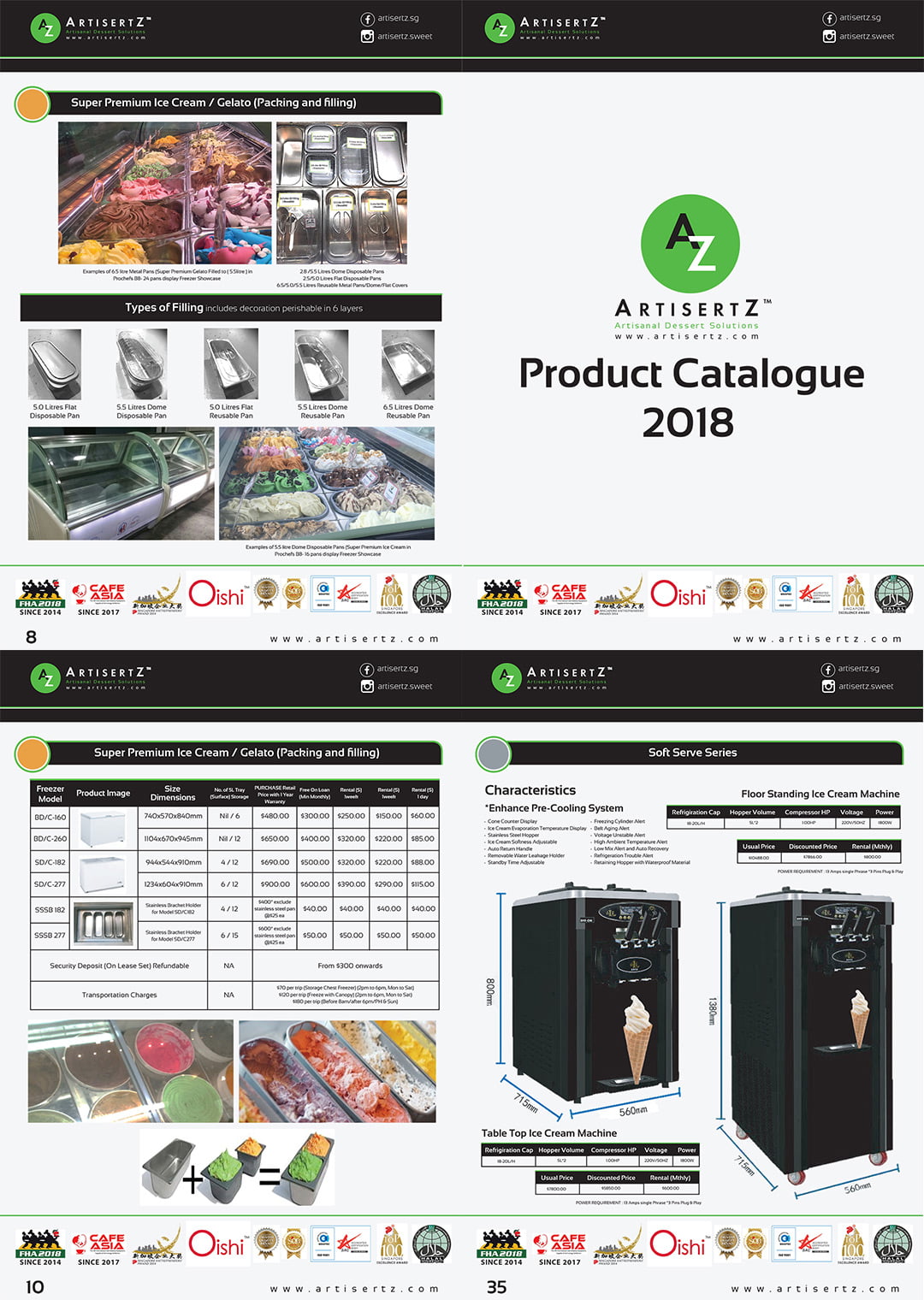
The client runs a successful ice-cream manufacturing factory supplying a full range of raw ingredients, accessories, and suitable machines for the ice-cream industry, mainly to chain restaurants, cafés, and ice-cream parlours.
The Challenge
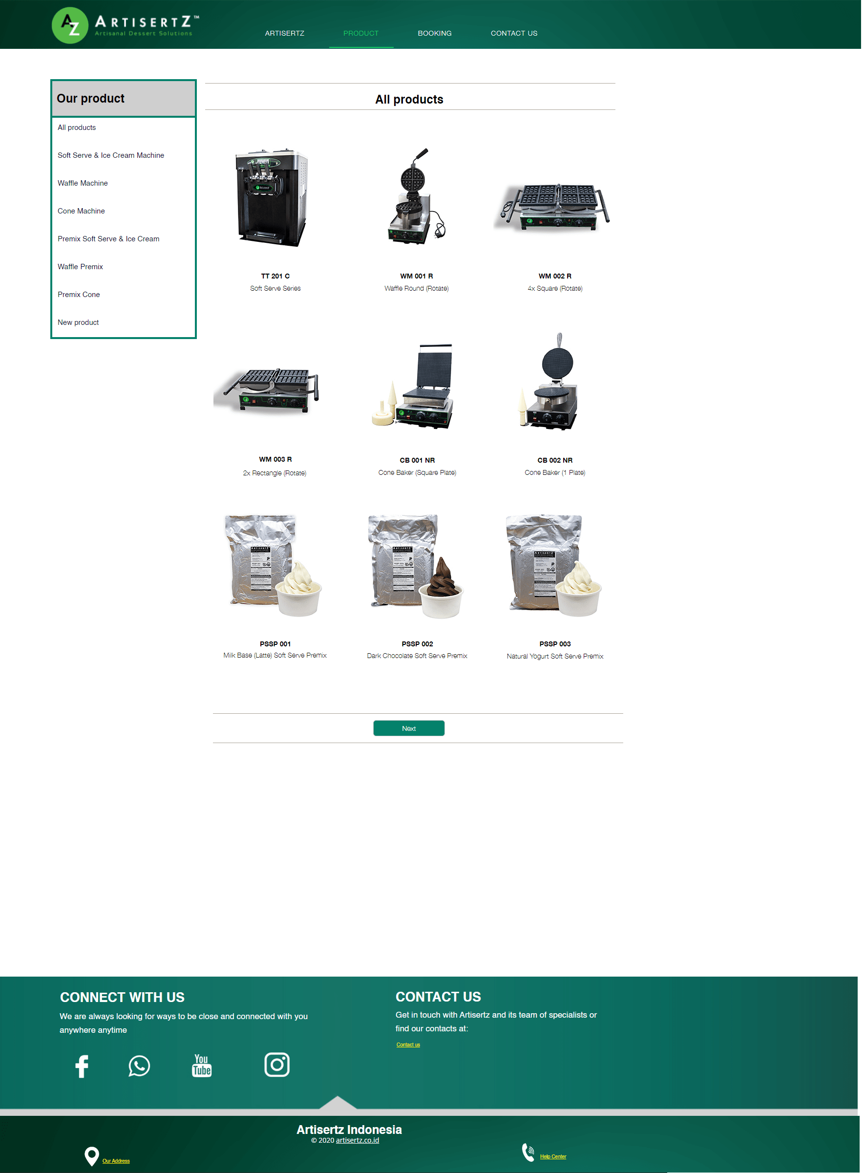
The client had recently embarked on the creation of their brand of pre-mixes which worked superbly well with their machines, which had been researched and developed over the years. The challenge was merging the two previously distinct product categories into one, and marketing them as one product to buyers. The client also had several hundred SKUs for us to trawl through to make sense of them.
Our Solution
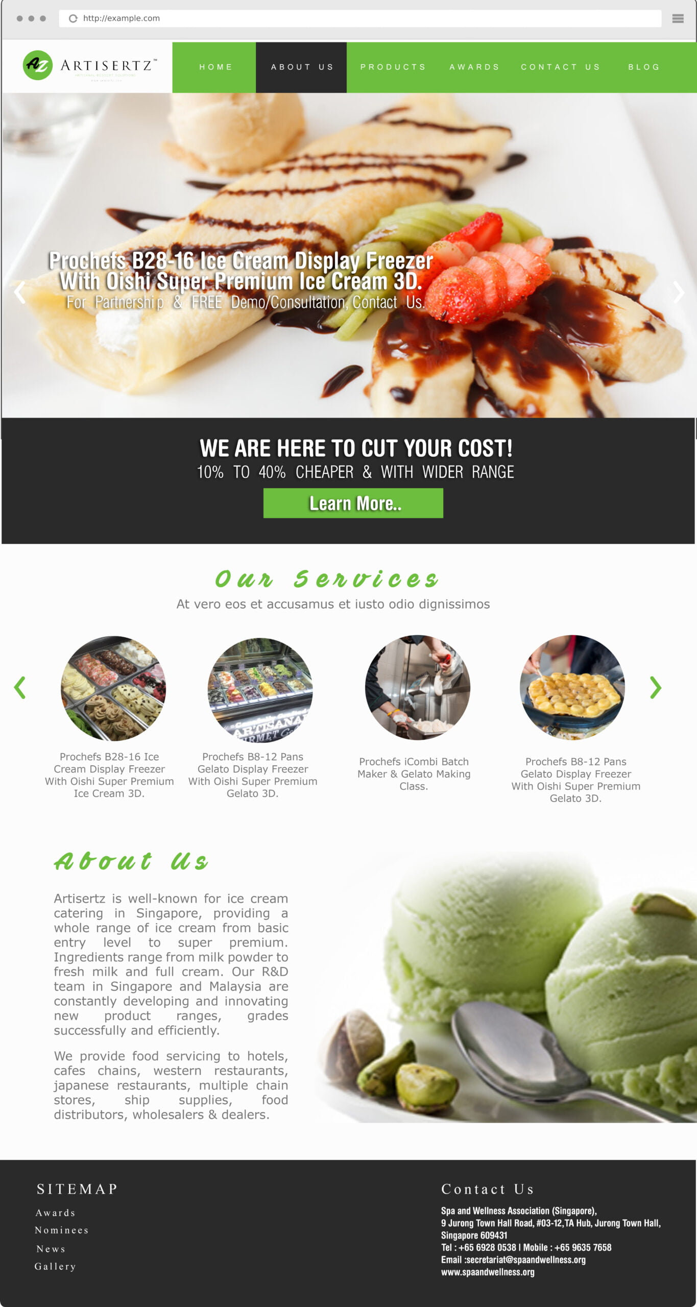
The name Artisertz is a combination of the word Artisanal and Desserts, spelt with a Z to denote the company’s ability to supply all ingredients from A to Z. The packaging and material designed were made to look modern, like a gaming console instead of the traditional stainless machinery look and feel. Proudly made in Singapore, the Singapore Merlion icon was also a necessity in the packaging design.
The Result
A consolidated website that presents the brand’s history, origins, showcasing their years of expertise as well as their products recombined into a single product category for easy selection by customers.

#logo #brochure #website #productdesign